How to Custom Graphics: Part 4 (Photography)
You've decided to do a custom graphic for your skis, but now what? While some people see this as an immense opportunity for creativity, others find it overwhelming and don’t know where to start. This is the fourth of five articles helping you hone in on places, avenues, and ideas to find and kick-start your creativity.
Let's talk about photography.
How do you use Photography on skis?
Photography is one of our most popular requests for custom topsheets. We've created everything from collages of insects, to kids art, to dog photos.. So let's dive into how to get the most out of photos on skis.
Why We Love Photography
Talk about making a custom ski, there is no way anyone else will have the picture of your kids on their skis (unless your partner duplicates your idea–yes, we've seen it done).
Between the newest iPhone and high-quality point-and-shoot digital cameras, to professional photographers, to stock photography, there's a lot you can do with photo skis. We've been asked to take a bunch of images and put them on another color, fade winter into spring images, or just take beautiful images of favorite people, places, and things and make it big for all to see.
How To Do It Right
1. Give us space!
Plan to give us some room to work. The way that we print our skis means that we need a fair amount of blank space along the edges and the top of image to work with. The image here shows the difference between what we show you, and what we print.

(P.S, we love how these skis have an artsy filter on them, it adds texture and another custom touch!)
2. Don't zoom in! Take the photo on the highest resolution setting you have. The bigger the image, the better your result will be.
This is true for ALL photography, and you can roughly judge by file size. If you have a 128 KB image, we know immediately that it is impossible to use. But if you have a 60 MB image, we stand a much better chance of getting great results. If you don't understand resolution (ppi), just go for the largest file you can get your hands on.
Even though these are professional images from Thrasher photographer Grant Brittain, smaller-resolution photos can work as a collage.
As for personal photos, assume that the photos you’ve taken on your phone are too small. This is 500% true if you took them while zoomed in. In fact, whether you're taking photos for your skis – or just for memories – don't zoom and crop your images afterwards with some photo-editing software.
3. Think about the layout (see "Overall Design Tips" below)
This especially applies to photos. Vertical images are best! Any image taken horizontally will most likely take up 1/8 of the space on your ski and, depending on the quality, we may not be able to make it much bigger.
A horizontal photo can become very dramatic if there is space to "extend" the image, such as the sky and foreground on this ski.
4. Think about lighting.
If your image is too-dark, or too-contrasty, it will end up that way on your skis as well. This is especially important if you are taking photos of artwork that you own (your child's or otherwise). While we can do a bit of retouching magic, we can only push an image so far before it starts to deteriorate.
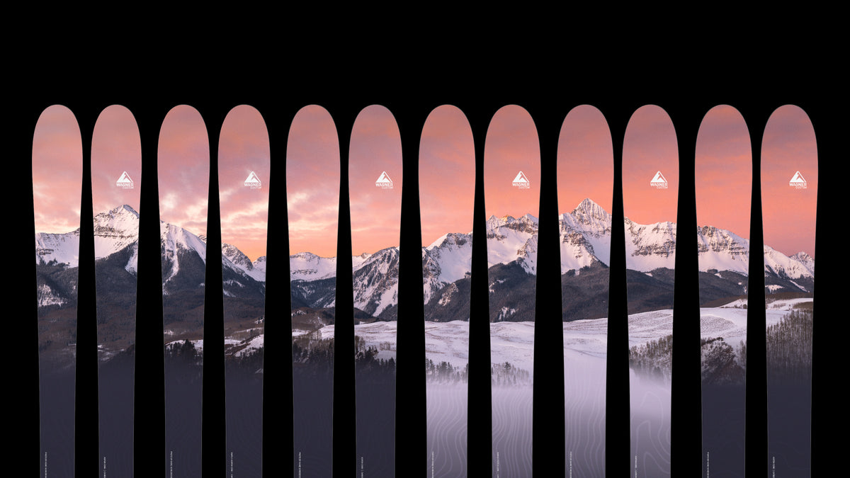
The sunset light on Shandoka makes for a serene but dramatic ski graphic.
4. If it looks blurry to you, it will be blurry.
Even though we are design wizards, there are some things that we can't change. Image quality is one of them. If we say the image is too small or that it will print blurry, there is not much we can do to change it–its a problem with the image, not the design.
5. Be flexible!
We always send a few options to consider when we layout your skis, and often we need to find alternative images that match our quality and dimension requirements. We will try to accommodate your images, but sometimes we'll ask you to find another layout our photo to supplement.
Some More of Our Favorites
This vector artwork of Six Shooter Peak gets laid over a photograph from NASA.

Something as simple as a photo of a chalk dust explosion can become a dramatic graphic when laid on skis.
Layering photos over each other can have some surprising results, such as this pair of skis.
OVERALL DESIGN TIPS
1) K.I.S.S (Keep it simple skiers!)
This is self explanatory. Simple, pointed designs almost always turn out better than complex, busy designs.
2) Remember the shape!
Wagner’s Graphic Guru Heather Baltzley always says “I can tell you a thousand ways to lay art onto a popsicle stick” and she’s not kidding. Skis are long and skinny with a middle portion that is covered when being used. That means vertical image or sideways panoramas work well.
3) Don’t be afraid to be abstract.
People generally see skis from at least 5 feet away, which is a great opportunity to be abstract with your designs.

